How Might We…refresh a team's brand to better reflect its evolving values and mission?
ROLE
Designer for Fusion (part of Optum)
Branding & Identity
User Interviews
6 months
January - June 2023

Fusion is an accelerator that drives innovation within UHG, enabling teams to define bold visions, understand user needs, and bring products and experiences to market with greater speed. As a collective of UHG employees, Fusion empowers teams to operate with agility and a user-centric approach.
Goal: Revitalize Fusion's visual identity to capture and reflect the team's evolution, growth, and new direction.
My Role
As a new team member, I found myself in the unique position of approaching the project without preconceived notions of the existing branding and story, allowing me to bring a fresh perspective. I focused on deeply understanding the team’s values and vision to accurately and authentically represent them visually. This approach enabled me to contribute meaningfully from the outset, and I quickly took on a hands-on role, even stepping into leadership positions on certain aspects of the project.
What does Fusion mean to Fusion?
In order to best visually represent the brand, it first involved diving deep into understanding the team. Through presenting a competitive analysis and interviews with leadership, I was able to gain insights into not only what Fusion meant to the members of the team but also what narrative they wanted associated with Fusion.
Leadership Interviews
I began the user interviews by engaging the leadership team through one-on-one sessions with each member. The goal was to uncover their perceptions of the current brand, their vision for its future, and the key messages they aimed to convey. These insights provided a foundational understanding of the brand’s direction, which guided the subsequent research and design efforts.
Culture Week
A few weeks later, during our Culture Week activities, I learned about the culture of the team through what they deemed were principles of Fusion along with different rituals the team was fond of.
Emerging Themes
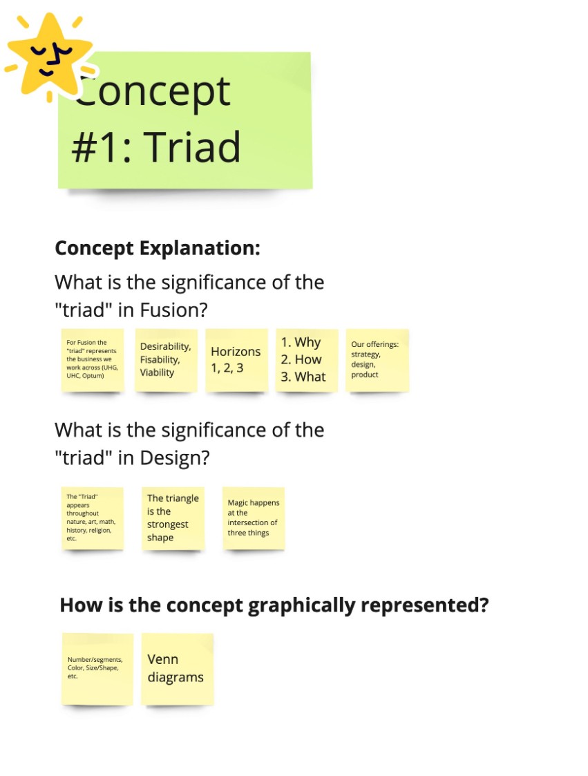
Triads
The first concept we explored was the idea of a triad. This symbol is significant to Fusion because it represents the three businesses at its core: UnitedHealth Group, UnitedHealthcare, and Optum. Additionally, it embodies the team's offerings in strategy, design, and product, positioning Fusion as the answer to the Why, How, and What.
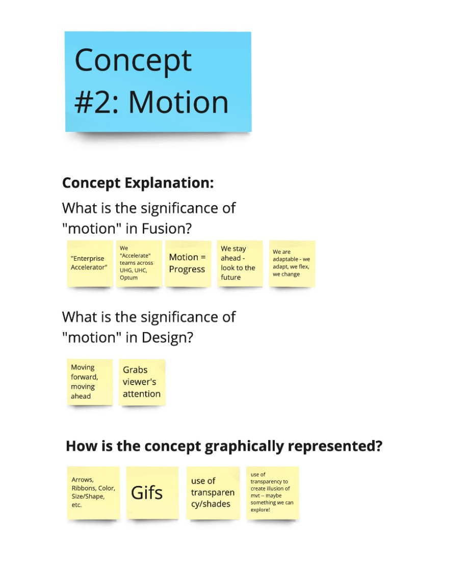
Motion
The second concept we explored was motion. This idea is central to Fusion, symbolizing adaptability, flexibility, and a forward-looking mindset. It reflects how the team stays ahead by embracing change. As an enterprise accelerator, Fusion aims to propel teams across UnitedHealth Group, UnitedHealthcare, and Optum toward future growth.
Ideate & Create & Ideate…
With the research in hand, we moved on to ideation and creation. We began by mood-boarding and sketching out logo concepts, drawing inspiration from the insights we gathered. It took numerous iterations and feedback sessions before we could refine the ideas further. We focused on two key concepts that we identified from our research analysis.

This process challenged my understanding of brand design and pushed me to think more deeply about the storytelling involved in visually capturing a team's essence through a logo and wordmark.
Color Explorations
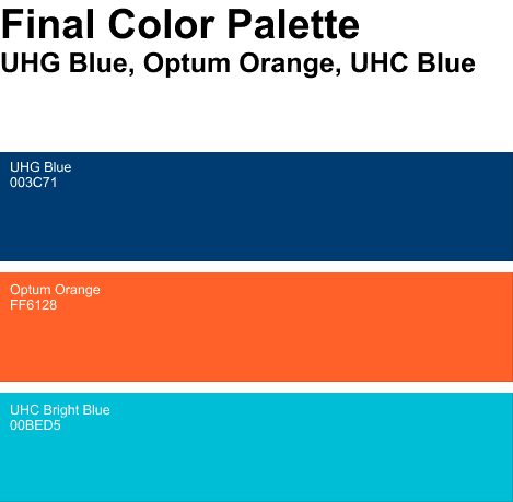
In the initial stages, we considered creating a unique color for Fusion, separate from the parent brands. However, finding a color that complemented the parent companies’ palettes while still standing out proved challenging.
Ultimately, we decided to use a combination of the existing parent company colors. This choice not only maintained visual harmony but also symbolized Fusion's integrated role across the enterprise.
Final Decisions
In the end, we narrowed it down to two logo options. The first featured overlapping squares, inspired by the double diamond process—a framework familiar to the Fusion team. However, after multiple iterations, we realized that this design felt a bit too contained and had associations with unrelated shapes, such as a pencil, bowtie, or even an eye.

Instead, we opted for a vertically oriented version of the design, which introduced a sense of motion and openness. By flipping the light blue to the top-right corner, we guided the viewer’s eye diagonally upward, creating a more dynamic flow that felt aligned with Fusion's forward-looking vision.

Learnings
I quickly learned that powerful brand work is being able to tell the story of a team through its visual elements and voice. In our Ideation phase, I came to realize how different design elements and choices can really affect the narrative. Small little tweaks in orientation, positioning, and size of different elements create different narratives to the design when working all together. Although this process is still in the works, I’ve learned valuable insights about brand work through the many months that we put into this project and recognize the impact of storytelling through visual design.
